Dark Mode & Accessibility: Beyond Aesthetics to Visual Ergonomics
Dark mode is a user expectation, but implementing it correctly requires understanding contrast, color volume, and visual fatigue. This article explores the design system approach to accessible themes.


Summary: Dark mode is not just “inverting colors.” It’s a separate visual environment with its own rules for contrast, saturation, and depth. The goal is visual comfort and readability across lighting conditions.
1) Design evolution
Dark mode moved from a developer niche to a system-wide standard on OS levels. Users now expect apps to respect their system preference automatically.
The shift is from “theming as a feature” to “theming as an accessibility requirement.”
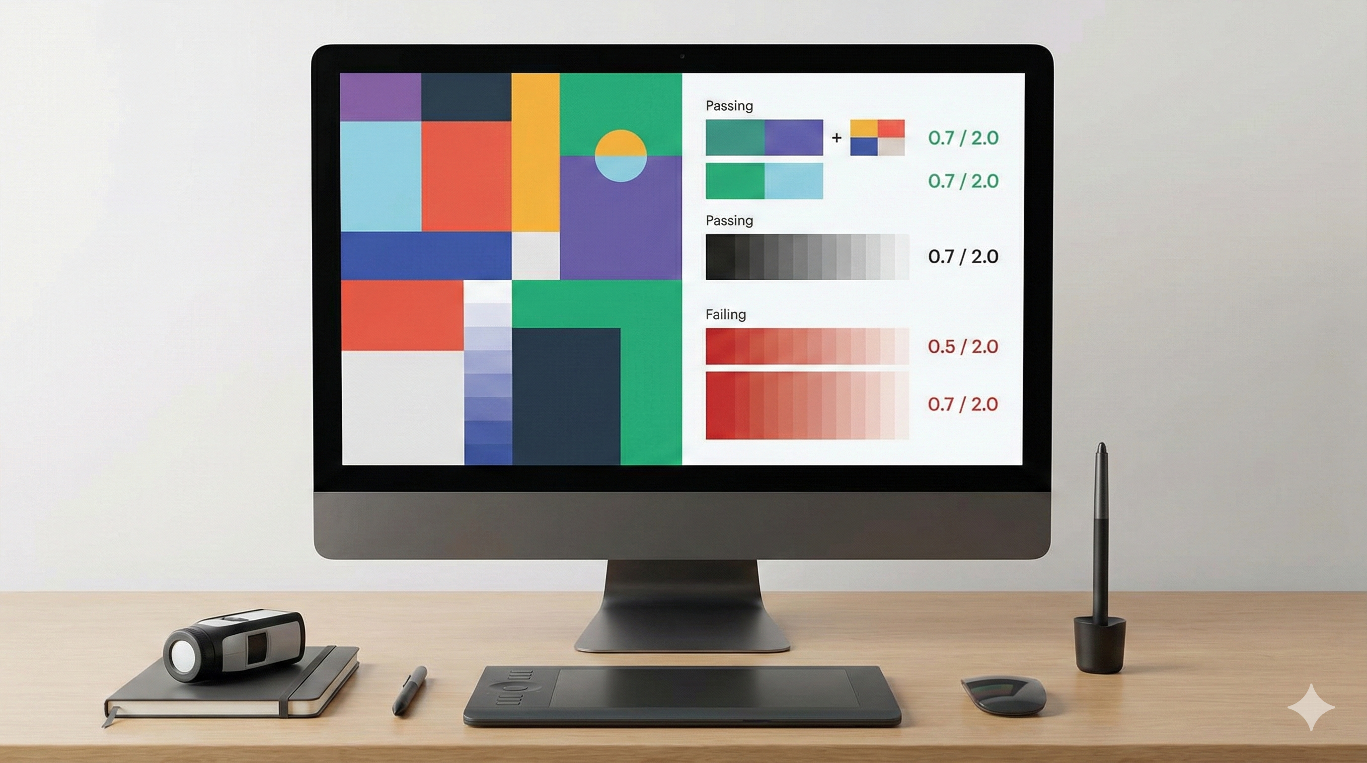
2) Core principle
The core principle is reduced luminance, maintained contrast.
- Backgrounds: Avoid pure black (#000000) which can cause smearing on OLEDs; use dark grays.
- Text: Avoid pure white on black (too much vibration); use off-white.
- Depth: Use lightness to show elevation (lighter = closer), not just shadows.

3) Human-centered impact
Positive: Reduced eye strain in low light. Positive: Battery saving on OLED screens. Positive: Accessibility for users with photophobia or visual impairments.
Negative: Halation (fuzzy text) for users with astigmatism if contrast is too high.
4) Real-world examples
- Code editors: syntax highlighting designed for long-duration focus.
- Reading apps: sepia and dark modes to match ambient light.
- System UI: automatic switching based on sunset/sunrise.
5) Key Insights & Trends (2025)
Dark Mode has graduated from a trend to a critical accessibility and health standard. In 2025, implementation goes beyond simple color inversion, focusing on contrast ratios, eye strain reduction, and intelligent adaptability to ambient lighting.
Key Trends:
- System-Wide Sync: Users now expect seamless synchronization of dark mode preferences across all devices and applications, with OS-level overrides becoming more intelligent.
- OLED Optimization: Designers are increasingly using “true black” themes not just for aesthetics but to significantly extend battery life on OLED-equipped mobile devices.
Data Points:
- 85% of users report preferring dark mode in low-light environments, cementing it as a mandatory accessibility requirement for 2025.
- Applications with optimized dark modes show a 15% improvement in battery efficiency on modern smartphones, a key selling point for power users.

6) Accessibility considerations
- Contrast ratios: WCAG AA/AAA standards apply to dark mode too.
- Color saturation: Desaturate colors in dark mode to prevent vibration and eye strain.
- User choice: Always respect system settings, but allow an in-app override.
6) Common mistakes
- Inverting everything: shadows don’t work the same way in dark mode.
- Saturated colors: bright blues and reds vibrate against dark backgrounds.
- Pure black: causes scrolling smear and harsh contrast.
7) FAQs
Q: Is dark mode better for eyes?
A: It depends on the environment. In low light, yes. In bright light, light mode is often more readable.
Q: How do we handle brand colors?
A: You likely need a separate palette for dark mode—desaturated and lightness-adjusted.
Q: What about shadows?
A: Shadows are invisible on dark backgrounds. Use surface lightness or borders to show depth.
Q: Is it hard to maintain?
A: Not if you use design tokens (semantic variables) instead of hardcoded hex values.
8) Forward-looking summary
Dark mode is a standard component of modern design systems. It forces designers to think about color semantically and structurally. The future is adaptive interfaces that respond not just to “dark/light” but to ambient conditions and user visual needs.
Related Articles
Related Articles

Generative UI/UX Design: When Interfaces Adapt to Intent
Generative UI promises interfaces that adapt to user intent in real-time. This article explores the design principles, cognitive load implications, and accessibility challenges of dynamic interfaces.

Modern UI/UX Design Principles: The Complete 2025 Guide
Master the fundamental principles of user interface and user experience design. Learn visual design, user research, accessibility, design systems, and modern tools to create exceptional digital products.

Motion UI: Enhancing Usability Through Meaningful Movement
Motion in UI is often treated as decoration, but its real value is communication. This article explores how motion supports usability, reduces cognitive load, and respects accessibility preferences.